Every year, the team of color experts at Pantone selects a shade for their Color Of The Year. The hue is meant to reflect the current year and is often used in fashion, beauty, and interior design. Pantone’s color of the year for 2022 is a beautiful shade of periwinkle called Very Peri.
What is Pantone’s Veri Peri?
Pantone’s 17-3938 Veri Peri is a beautiful shade of violet periwinkle with blue and red undertones, making it a stand-out color that will pop out in any space without taking away from the room’s overall design.
Typically, Pantone selects a color from a roster of pre-designed colors and dubs that their ‘Color of the Year.’ However, this year marks the first time in Pantone’s educational color program history that they chose to create an entirely new color. Their decision to create a new shade was meant to reflect the innovation and transformation that is taking place in our society, offering a new way to express ideas and emotions.
According to their website, “Very Peri is a symbol of the global zeitgeist of the moment and the transition we are going through. As we emerge from an intense period of isolation, our notions and standards are changing, and our physical and digital lives have merged in new ways […] Very Peri illustrates the fusion of modern life and how color trends in the digital world are being manifested in the physical world and vice versa.”
Interested in decorating with this new shade but unsure where to start? These ideas will show you how to decorate with Pantone’s Veri Peri in any room:
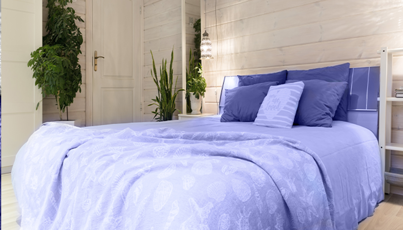
Tip #1: Integrate Veri Peri with Colors from Nature
The shade periwinkle is derived from the perennial periwinkle plant which is native to Europe, Africa, and Asia. As a result, it’s no surprise that the color periwinkle works best with rich shades from nature and earthy tones such as clay, moss, granite green, elderberry, eggshell, chai, oak, cloud, cornsilk, or fuschia.
Tip #2: Test the Color by Decorating With Items You Can Easily Swap Out
While we love this new shade of periwinkle, it may feel a bit risky to make this shade the focal point in a room. After all, it’s bright and lively and really makes a statement. To experiment with this shade, invest in less expensive items that can easily be swapped out if they don’t feel right in your home. Examples include hand towels, bath mats, candles, inexpensive wall art, faux flowers, etc. Here are some of our favorites: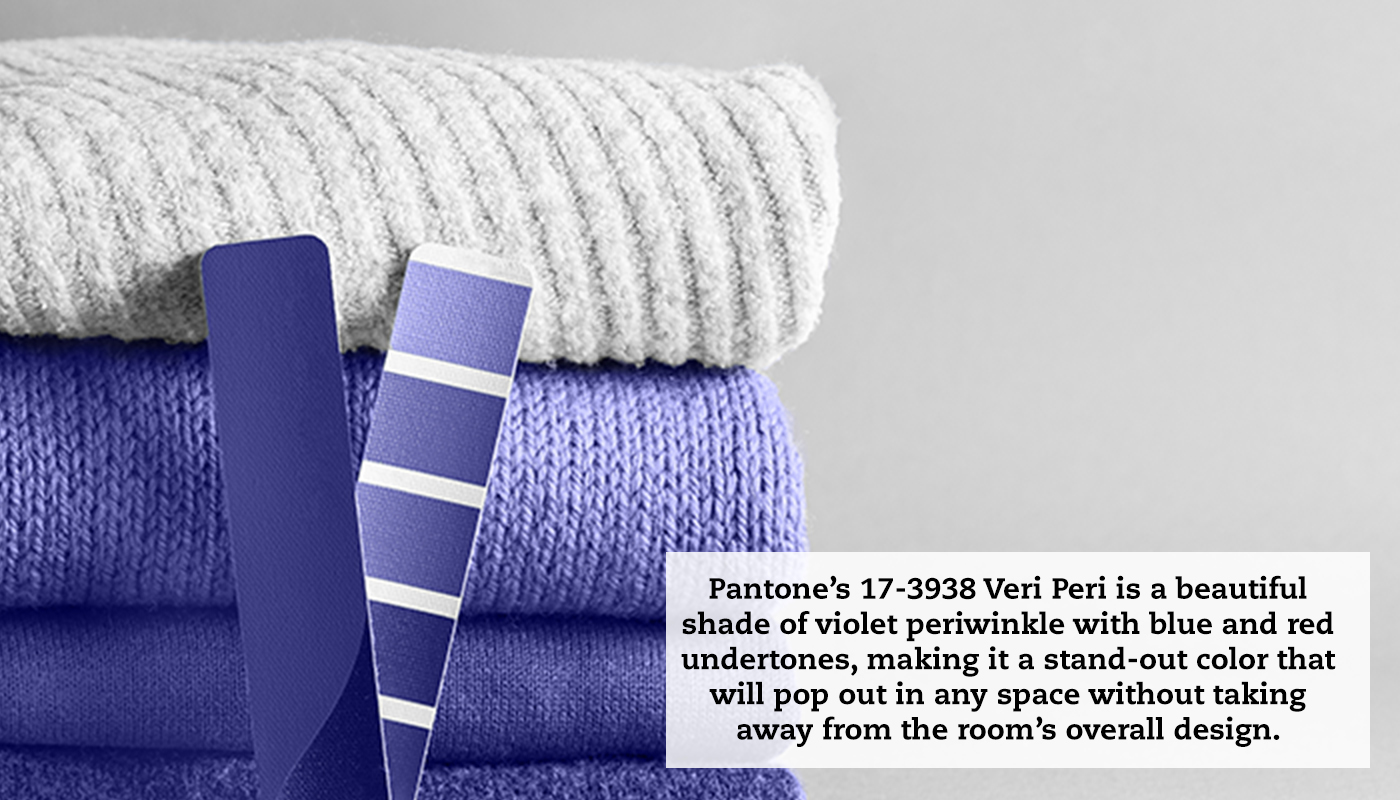
Books:
These Very Peri hardback books from Booth & Williams are an excellent addition to any bookshelf. Wrapped in a demask patterned paper, they include a variety of literary works, texts, and period novels.
Pantone-Themed Coffee Mug:
What better way to incorporate the color of the year than a Pantone-themed mug? This ceramic mug from Etsy features Pantone’s Veri Peri Color of the Year and comes in 11oz and 15 oz options.
Hand Towels:
This plush, lightweight hand towel from Figs Linens and Home in periwinkle or this monogrammed antimicrobial towel from Neiman Marcus will make a great addition to your bathroom.
Bath Mats:
This striped bath mat from West Elm and this bath runner both have shades of Veri Peri.
Candles:
Options include this scented candle from Brooklinen or this VOLUSPA candle from Nordstrom.
Wall Art:
We love this framed cheetah piece, this Chanel No. 5 piece, and this Mickey Mouse art from Urban Outfitters—all featuring periwinkle hues.
Faux Flowers:
These periwinkle faux flowers (which look real!) pair perfectly with this bubble vase from Sage & Sill or this terracotta vase from Afloral.
Throw Pillows:
A simple throw pillow in periwinkle works well on a beige, white, or light-colored couch/chair and can easily be swapped out or used in a less visible area if you don’t like how the color blends with your space.
Rugs:
This beautiful rug from Overstock weaves periwinkle tones into the space without being a distraction, while this rug from Wayfair makes more of a statement.
Tip #3: Incorporate Perinwinkle into Your Outdoor Area
If your apartment has a balcony or outdoor area and you’re feeling nervous about incorporating Very Peri in your home’s interior, try weaving this color scheme into your outdoor space instead. This can be achieved by investing in outdoor dining sets, side tables, planters, area rugs, and outdoor throw pillows. Here are some of our favorite picks:
Outdoor Furniture:
This bright two-person bistro table and chairs or this end-table/coffee table both add a fun pop of color to an outdoor setup without being overwhelming.
Outdoor Throw Pillows:
This woven outdoor pillow is a great way to subtly weave periwinkle blue into an outdoor space while this outdoor pillow is reversible, with a violet shade of periwinkle on the front and a shade of white on the back.
Outdoor Planters:
Periwinkle blends beautifully with colors from nature, especially leafy green plants. Blend periwinkle with shades from nature with this glaze ceramic planter, this ceramic planter by Joss & Main, or this rounded glaze planter.
Tip #4: Decorate With Soft, Velvety Fabrics
Veri Peri often works best with soft velvety or cotton textures, which is helpful when choosing fabric for pillows, throws, and curtains in your apartment. We love this velvet throw from Amazon and this cotton summer throw blanket which weaves in a range of colors, including various shades of periwinkle. This lumbar pillow cover from AllModern and these pillow covers bring soft velvety textures to a space—just don’t forget to buy the pillow inserts!
Final Thoughts
If you are in the market for a new apartment, Draper and Kramer’s spacious and luxurious apartments offer the perfect canvas to decorate with shades of periwinkle and create a warm, welcoming home. Many of our apartments also offer private outdoor space, offering even more space to experiment with Pantone’s new shade of Veri Peri. Visit our website to browse our full selection of apartment properties today.